The Swiss banking market is among the most traditional in Europe. With a number of native traditional, private banks and a few European challengers attempting to penetrate the market, it stands to say that the digital banking landscape is evolving rapidly in the last 2 years and especially in the last 6 months.
Both traditional banks and challengers are heavily investing in the digital banking system while private banks are trying to fully-serve their customers digitally through the introduction of advanced digital banking products and services.
Just in the last week, 2 new digital features were introduced by a large private bank while the rest of the Swiss market knows little about that recent change. Fintech Insights, a digital banking research platform that analyzes the digital banking of banks and fintechs worldwide and evaluates their UX, always keeps up with the latest breakthroughs in the market.
From our research, we have understood that for Swiss banks creating a new feature is a lengthy process that at times leads to extended delivery time. For this reason we wanted to step into the shoes of a Swiss digital banking team which has to compete with challengers and private banks.
We came up with a sample scenario of a fictional bank called Grindelwald that wanted to introduce a new digital banking feature: setting a savings goal with a recurring payment to it.
It is an extremely important addition as this feature highly engages customers as it helps them simplify their daily finances by taking manual saving of their hands.
Through Fintech Insights, Grindelwald bank was able to quickly introduce a new feature in half the time and with less trouble.
How was the fictional Grindelwald bank able to do that?
Step 1: Identify competitors that offer the same feature
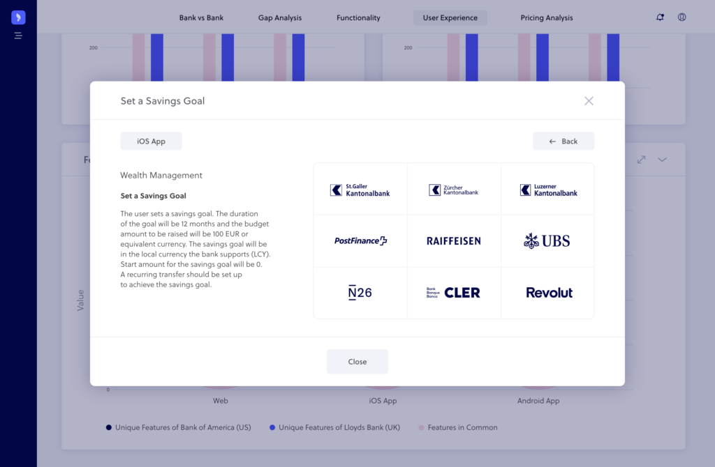
The first step to improving the bank’s feature set was conducting competitive analysis of their market. The image above shows which banks in Switzerland offer the Set a Savings Goal feature.
With Fintech Insights, the fictional bank was able to analyze all their competitors’ digital offerings and discovered that 9 banks in the Swiss market offer this particular feature.
Step 2: Know which competitor does it best
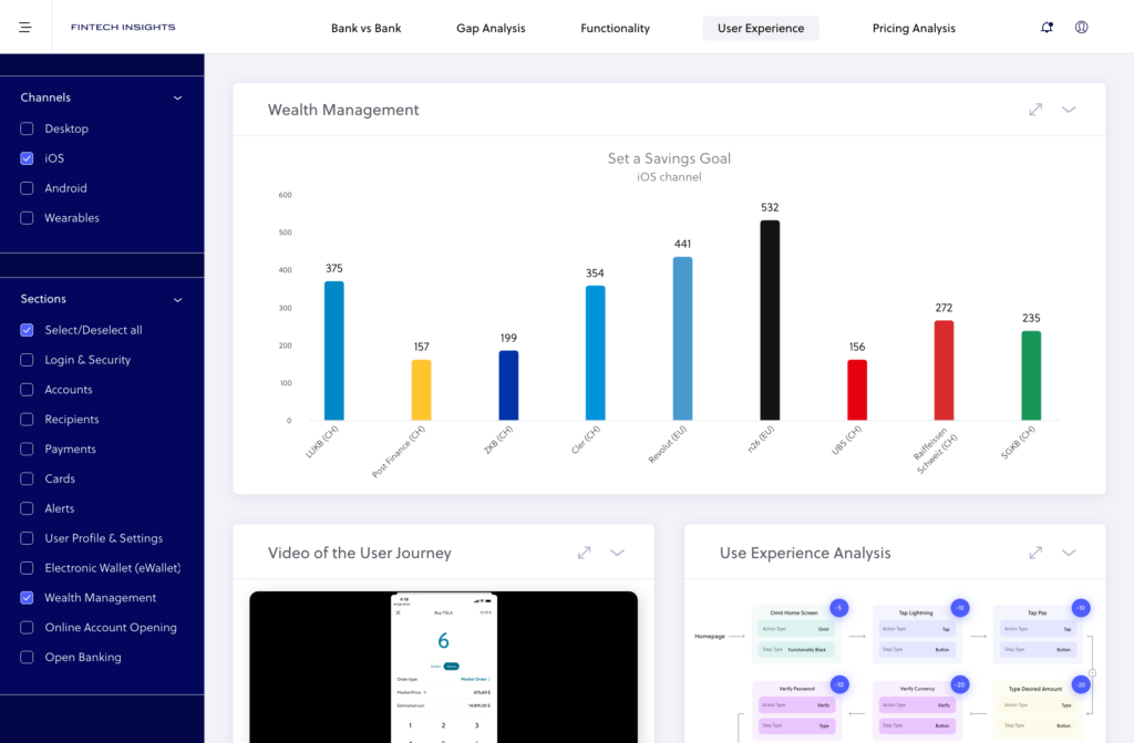
As can be seen in the UX ranking of the Set a Savings Goal feature in the above image, Grindelwald bank discovered which of the Swiss banks offer the most user-friendly journey.
The ranking showed that N26 offered the best UX journey with a score of 532/1000 according to Fintech Insights’ Perfect 1000 scoring system. Then it could choose to get inspired by how N26 did it.
Step 3: Know which competitor internationally does it best
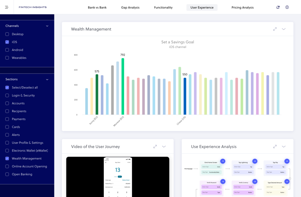
Then, as illustrated in the global ranking of banks that offer the Set a Savings feature above, they knew that Monese (EU), bunq (EU) and Chase (US) had created user-friendly journeys.
The bank did not only get an overview of the Swiss market, but also found out which international banks offered this feature with the best UX.
This way, they knew the best practices worldwide and used them to plan their new features.
Step 4: Understand how they do it
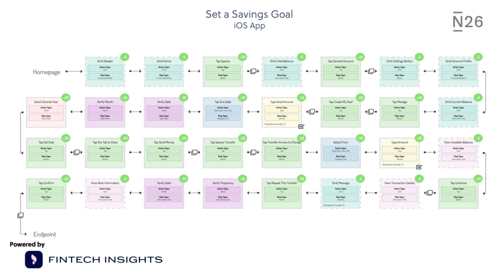 The flowchart image above shows every single step users need to follow to complete the Set a Savings Goal process in N6. Every step is UX-evaluated.
By using Fintech Insights, the hypothetical bank could with a few clicks know exactly how N26 has managed to create the most UX friendly journey.
This allowed Grindelwald bank to learn from N6 and include elements of that feature into their new product design.
Step 5: Understand their omnichannel coverage
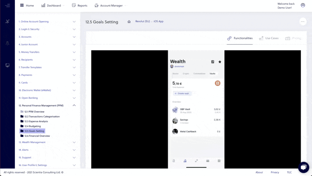
In the above video we see how the fictional bank was able to see how Revolut (or any bank for that matter) offers the Set a Saving Goal feature in its iOS and Android channels.
Simply by clicking a button they could see how it is done across all channels. With that information at hand, they ensured that their new feature will achieve omnichannel coverage.
Step 6: Create the new journey from scratch using best practices globally
Having completed an exhaustive competitor analysis on the Swiss market and knowing which banks offer the Set a Saving goal feature locally and globally, the bank could organize a design plan.
Using the videos and flowcharts of the best UX journeys, the bank can create a thorough plan of the whole digital product development process which was influenced by the best practices.
This ensures that their design process would be smooth and their product engaging to the bank’s customers.
The real benefits
Through the utilization of Fintech Insights, the digital banking team managed to:
- improve their go-to-market time by 50%
- have assurance that their new feature follows the best practices and stands out in the market
- have a clear view of what their direct and indirect competitors offer
- exploit gaps in the market and introduce a feature that customers truly need
- stay within the production deadline
- avoid the extra cost of delays
- avoid team burnout by simplifying the product development process,
- be sure of their decisions through concrete business cases
Explore Fintech Insights and find out how your bank can offer the best-in-class features worldwide across all channels while cutting down your product development time.
The post Digital Banking: Release a New Feature in the Swiss Market in Half the Time appeared first on Fintech Schweiz Digital Finance News - FintechNewsCH.
Comments